
Project Summary📝
In a constantly changing world, a brand's image is a window into its identity and values. For this reason, we embarked on an exciting project to give a new impetus to the visual identity of Smart People English. In this case study, we will explore the process of redesigning your logo to reflect the essence of the institution and project a modern and attractive image.
Team 👨💻
1 Project Manager
1 Graphic Designer
Project Type 📌
Branding & logo design
Tech / Tools ⚙️
Figma, Illustrator, Photoshop, Odoo, Adobe Acrobat
Deliverables 📦
Brandbook
Source files (Ai, Ps, SVG)
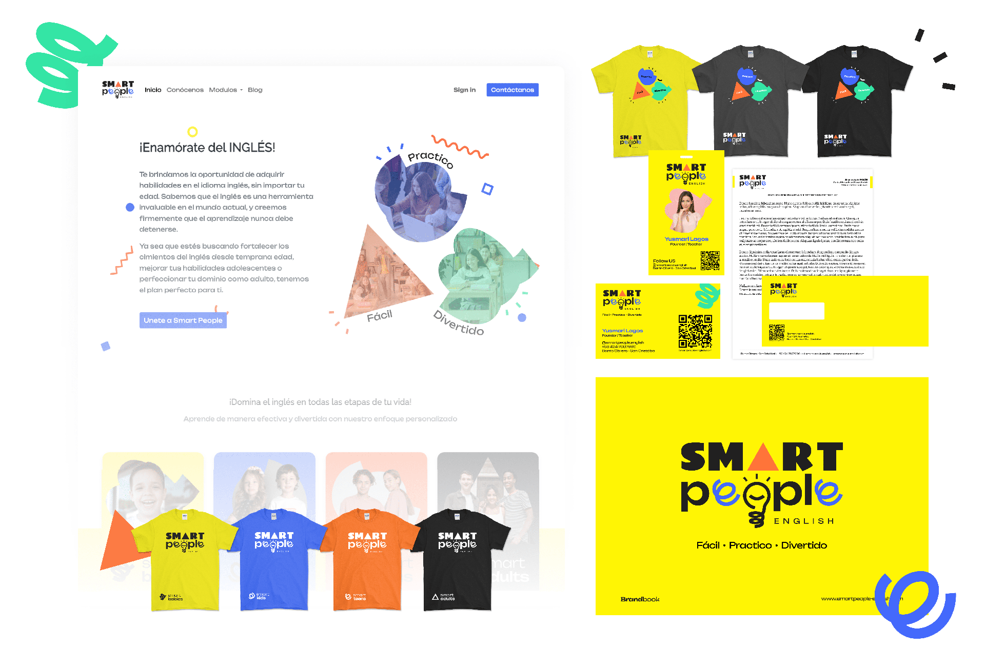
Social Media Pack
Website
This process not only aims to create an attractive logo, but also to build an enduring symbol that reinforces SEP's identity and inspires its language community on its path to learning and excellence.
Problem / Challenge 🤔
Problem / Challenge 🤔
Disconnection between the logo and the rest of the elements used by SPE
Saturated logo First Challenge
El logo actual presenta un exceso de elementos que podrían dar una impresión de sobrecarga visual. Durante el primer análisis, hemos identificado que se utilizan más de 3 fuentes tipográficas, además de un icono que interfiere con una de ellas. Dada la trayectoria de SPE como empresa establecida en el mercado, se muestra una clara preferencia por no realizar cambios drásticos en su logo actual. Por lo tanto, nuestro verdadero desafío radica en optimizar lo existente, buscando mejoras significativas sin alterar en gran medida la identidad actual de la marca.

Guideline non existent
Second Challenge:
The absence of a defined base makes it quite probable that in various applications and elements related to the brand, there is no coherence or a consistent graphic style. Therefore, our task is to create a clear visual environment that makes it easy to recognize the various options offered by SPE, without sacrificing the harmony between them. We will seek to establish a strong visual guide that maintains the unique identity of the brand, while allowing controlled flexibility to adapt to different contexts without losing its distinctive essence.
💠 The solution /Our Approach
💠 The solution /Our Approach
La estilización es el camino.
Begin:
Update Logo
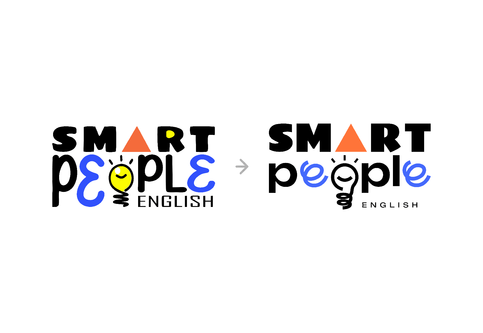
The first step consisted in redoing the SPE logo keeping its original structure. To achieve this, we narrowed down the fonts to two main ones, both with significant adjustments. On the word "smart", we corrected the finishing to adopt a more sans-serif style, while for "people" we chose a sans-serif typeface that would also be used for "English".
We kept previous elements, like the triangle on the "A" and the lightbulb icon that replaces the "o," though we adjusted the weight of the lines to better align with the rest of the typeface. The emphasis on the "e" also underwent a change, removing the previous reference to the "3" which added nothing visually.
Our goal was to preserve the key elements to be able to use them in various future applications, without compromising the main structure of the logo.
Setting Standards
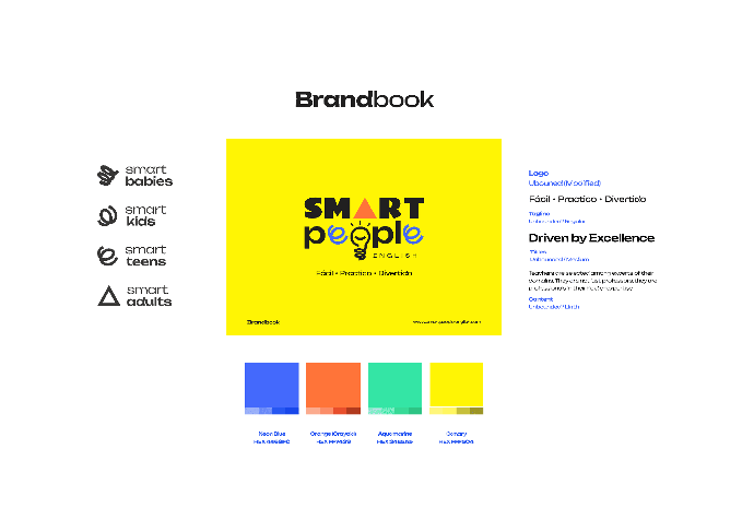
Brandbook:
The next step was to create the foundations of the graphic and visual world of SPE, all framed in a guideline that could be consulted to address any questions or future applications.
Harmony was essential throughout the process to avoid any disconnection with the main idea. We wanted to ensure that each component fit together in a cohesive way, creating a coherent and attractive visual identity for the brand, while preserving its essence and recognizability in all graphic applications.
La armonía fue fundamental en todo el proceso para evitar cualquier desconexión con la idea principal. Queríamos asegurar que cada componente encajara de manera cohesionada, creando una identidad visual coherente y atractiva para la marca, mientras se conserva su esencia y reconocibilidad en todas las aplicaciones gráficas
Online Presence
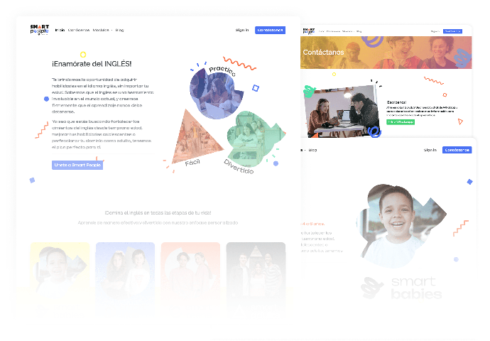
Website:
Once we established a strong graphic pipeline, we embarked on the task of completely updating the online presence and artwork, building on this process to create the official SPE website.
Result 🚀
The final result was a renewed and improved logo that retains the original identity of the brand but with a more current and coherent appearance. The redesign provided the language school with a strong and distinctive visual identity that reflects its commitment to educational excellence and its modern approach. With the guideline in place, SPE now has a clear guideline for applying its brand image consistently across all communications and graphic applications.
The new logo and visual guidelines allow SPE to project a consistent and professional image, which strengthens its position in the market and improves the perception of its language community. The revamped official website provides a more attractive and functional user experience, facilitating interaction with visitors and providing a positive impression of the brand.
In conclusion, the redesign of the logo and the update of the online presence have been a resounding success, giving SPE a revitalized and unified visual identity that has strengthened its position in the competitive language education market. These changes have effectively addressed the main issue that started this project, ensuring that the brand now projects a consistent and professional image, in line with its commitment to educational excellence and innovation.